
Icons by the people
@ Capital One
Summary
I created a comprehensive UI Icon Contribution Guide to allow anybody to create the custom UI icons they needed.
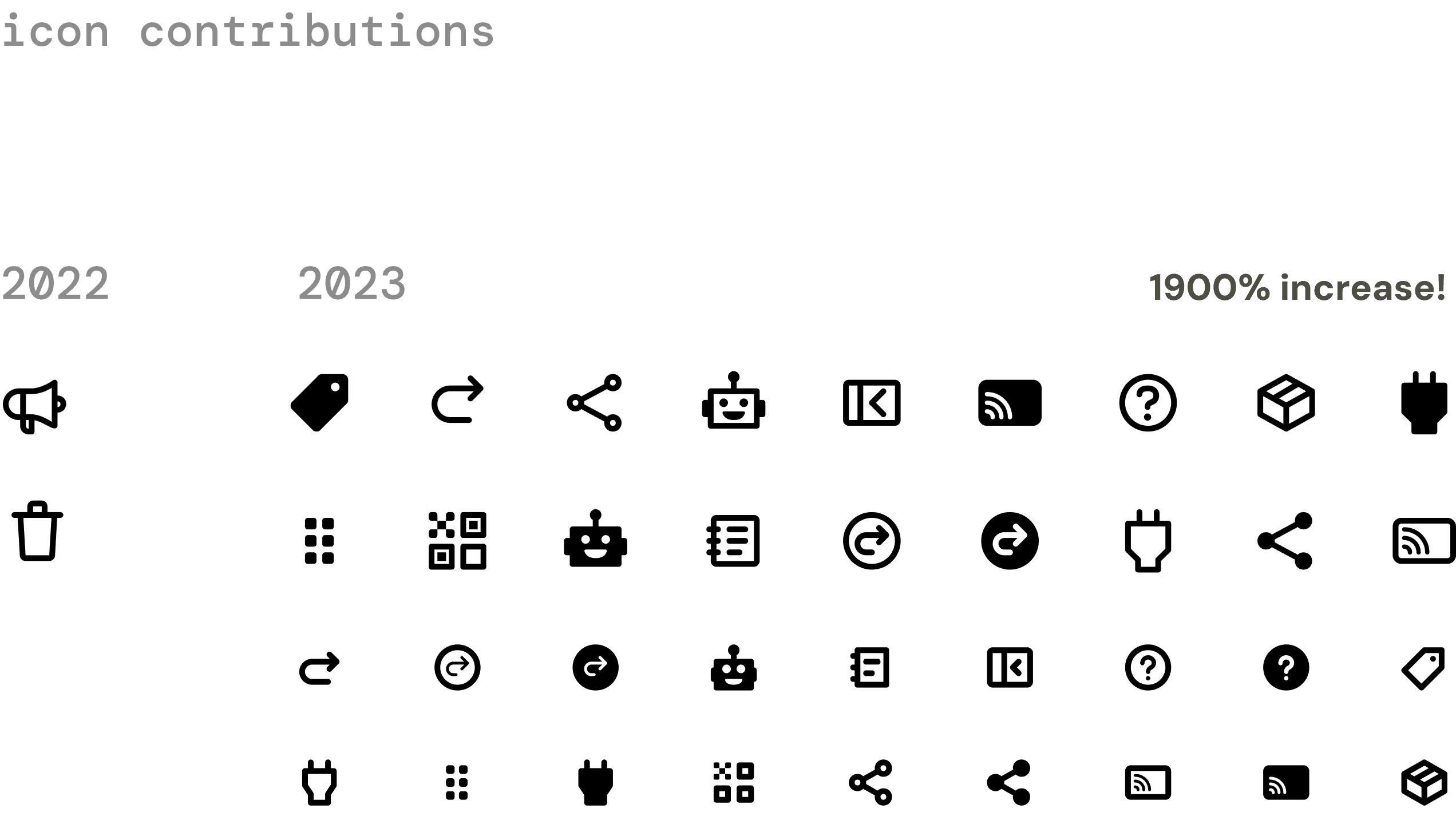
Forty icons were added to the system in one year using the contribution guide and process, compared to two icons in the previous three years. It became an easy and efficient way for designers to engage with the design system and get what they needed.
Key skills
Design documentation
Design education
UI icon design
Role
Lead designer
Timeline
Q3 2023 - Q4 2023
Our problem
Historically, all of the UI icons available in our design system were created by one person, our lead design system designer. When any new icon request arrived, its completion and addition to the system was completely dependent on his availability and priorities. If others wanted to contribute icons, it still required time to give all the right resources so that the icon could be created correctly and fit into the design system’s icon visual language.
We had 2 icon contributions to the design system over 3 years. As we heard more frequent interest in custom icons, we wanted a simple way for designers to get the icons they needed on their own timeline.
How I solved it
01 Auditing existing resources
Our lead designer had all of the right information floating around in his head and desktop, but we needed to translate it all into something quickly sharable and scalable. I started the project by reviewing all of his bookmarks, notes, and other icon resources that existed in external design systems and around Capital One.
02 Understanding the designer's experience
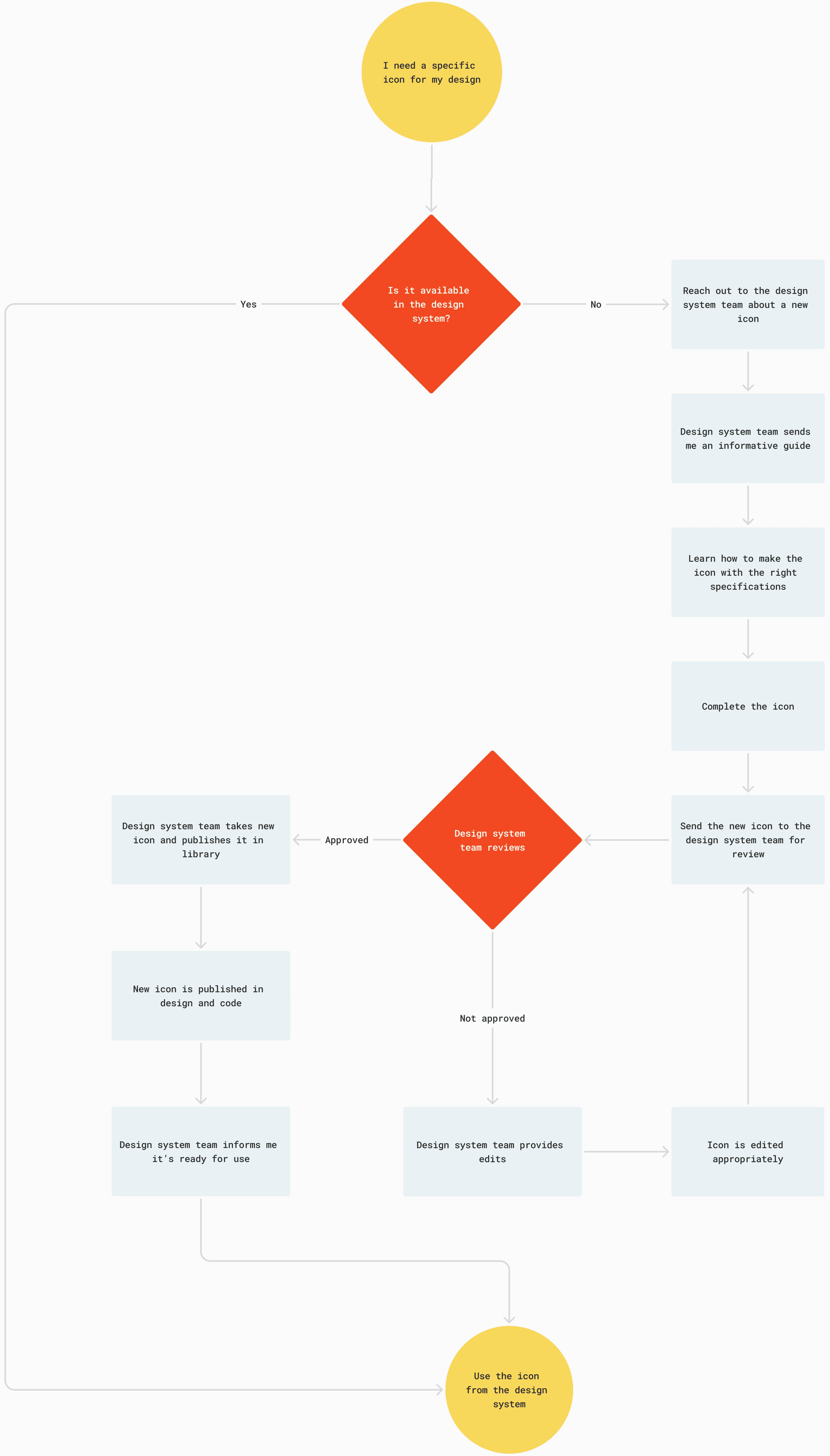
The designer’s journey starts when there’s an idea for a custom icon or a recognition that the needed icon doesn’t exist. The journey ends when that icon becomes available as part of the FS Design System icon library.
After auditing the resources, seeing typical structures for “how-to” guides, and assessing all of the icon info that needed to be provided to a designer, I charted out what felt like an intuitive process for learning how to create icons and then contributing them back to the design system.
03 Learning how to make icons
A critical part of this whole process was learning how to make the icons myself. I recreated existing icons in both Figma and Illustrator until I could identify the steps for creating a successful icon and knew I could convey it back to an audience of designers, both in writing and verbally, as simply as possible.
04 Outlining and creating the guide
Going through the designer journey myself led me to a two-part solution: a guide for learning and a workspace for creating. All the info I had stored about icon specs, steps to flatten, naming structure, etc. would be housed in the educational guide as a reference point. The steps I had just gone through myself to create the icons would be turned into a simple workspace, with the right space setup, tools, and prompts to complete each step.

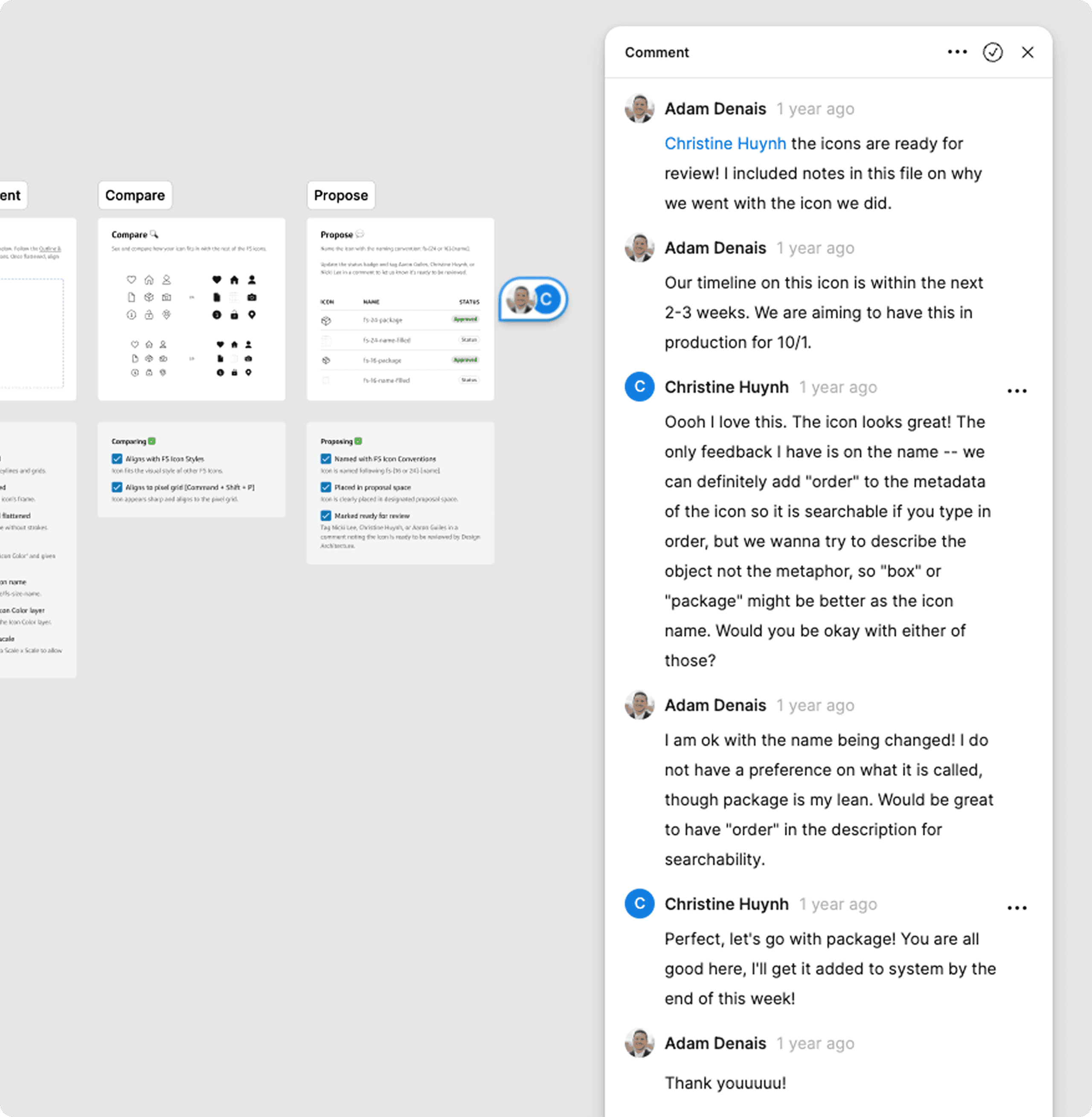
05 Testing it with designers
Once the first draft of the guide was completed, I tested it with my own team and with two designers who had previously tried to contribute icons. With minimal instructions, I observed how they moved through the guide and recreated an assigned icon.
Testing was tremendously helpful in highlighting understanding gaps, important steps that were slipping through the cracks, and unanswered questions. Flattening and outlining and expanding are easily confusable. When are you supposed to give the icon a name? Do I keep editing the component or the draft after edits are given?
As testing always does, it showed me where my expectations were right and wrong and I used the feedback to continue iterating, adding, and taking away until it was something greater.
The solution
The UI Icon Contribution Guide came to life with three main parts: the guide itself, the workspace, and the demo. All of these were housed in one Figma file, easy to find, share, and duplicate for different icon projects.
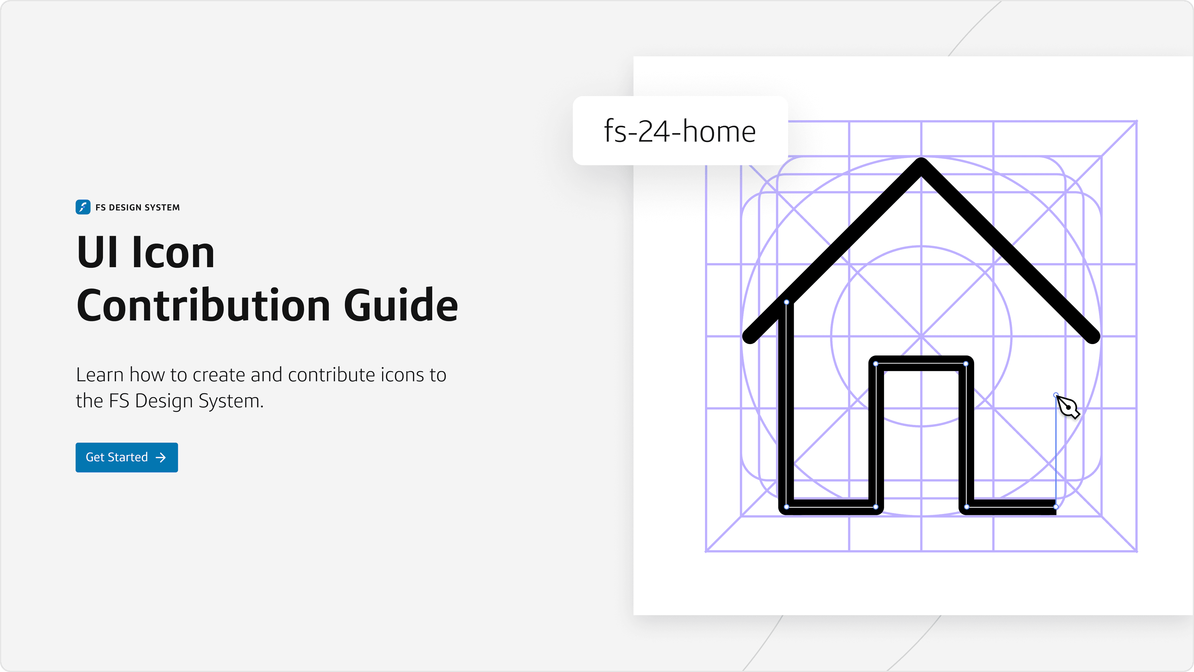
01 The guide
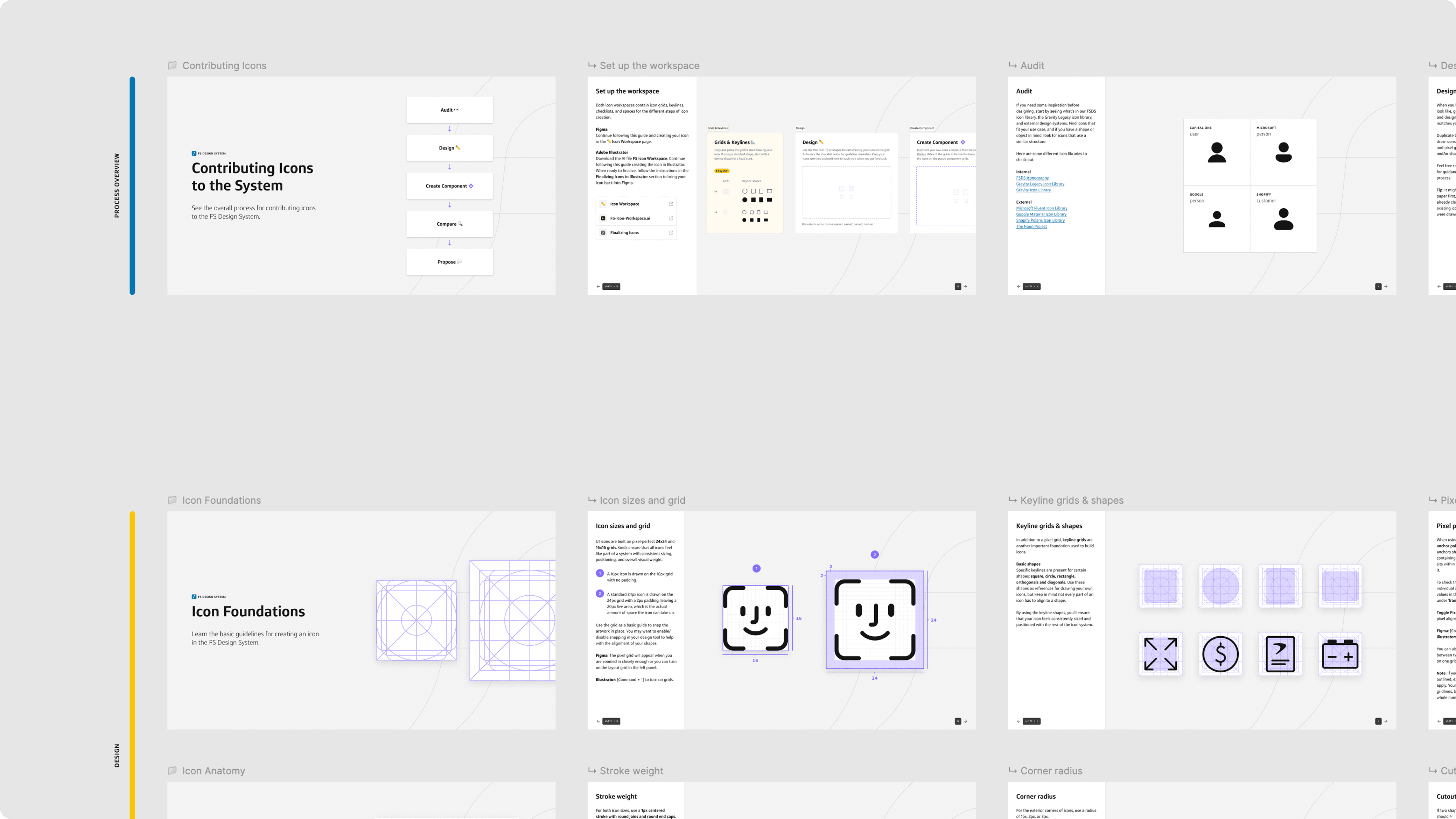
The guide portion consists of the rules, guidelines, and principles we use to create a cohesive system of UI icons for our design system. It’s a reference point for the nitty gritty details, most common questions, and a look at the overall process of creating an icon beginning to end.
Key features
A full process overview, from designing to proposal to publishing in the design system
Icon design foundations, including sizes, grids, keyline shapes, pixel perfection, optical alignment, and more
Specific icon anatomy guidance, including stroke width, corner radius, cutouts, and naming
Export and proposal instructions for both Figma and Adobe Illustrator
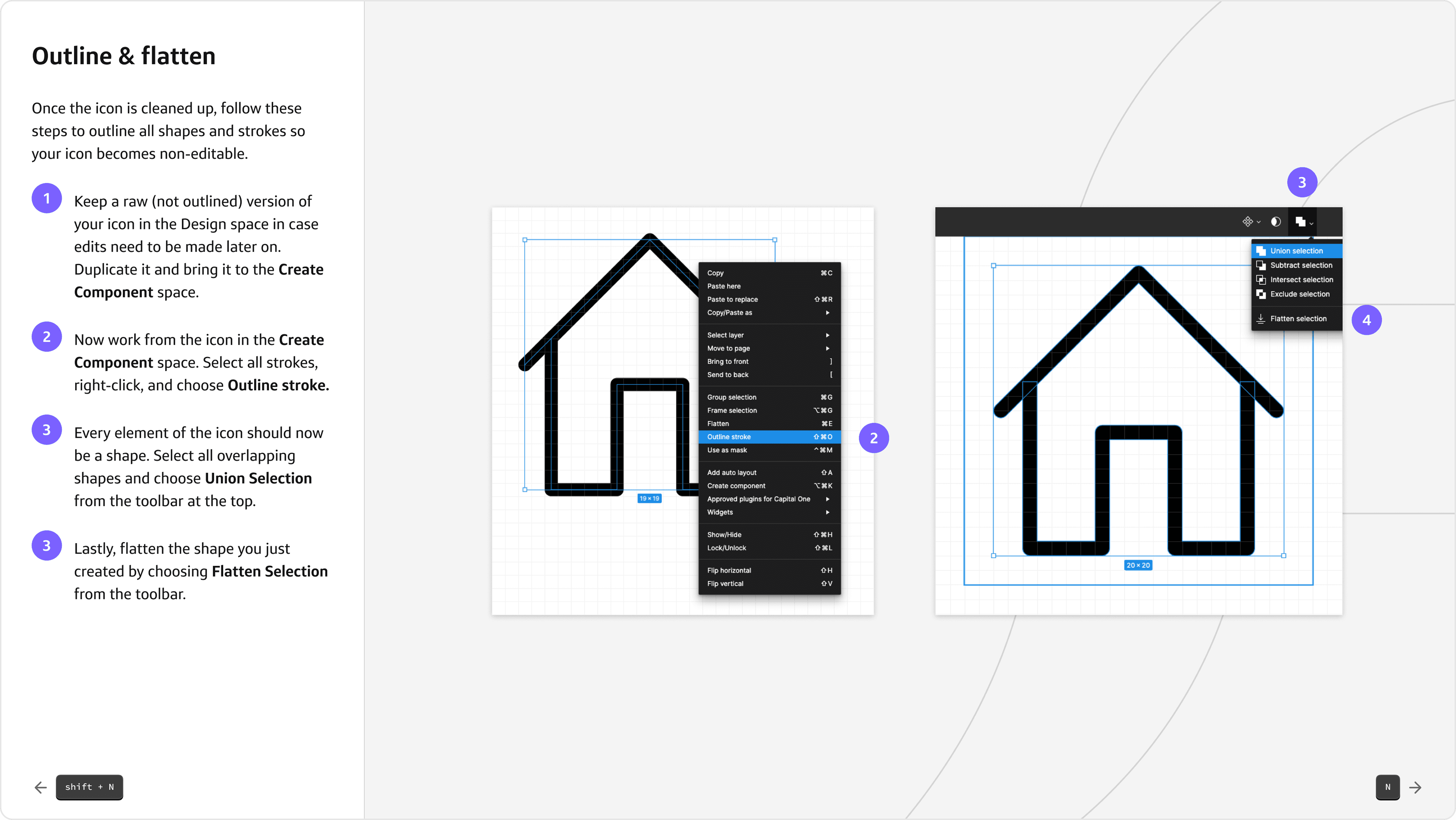
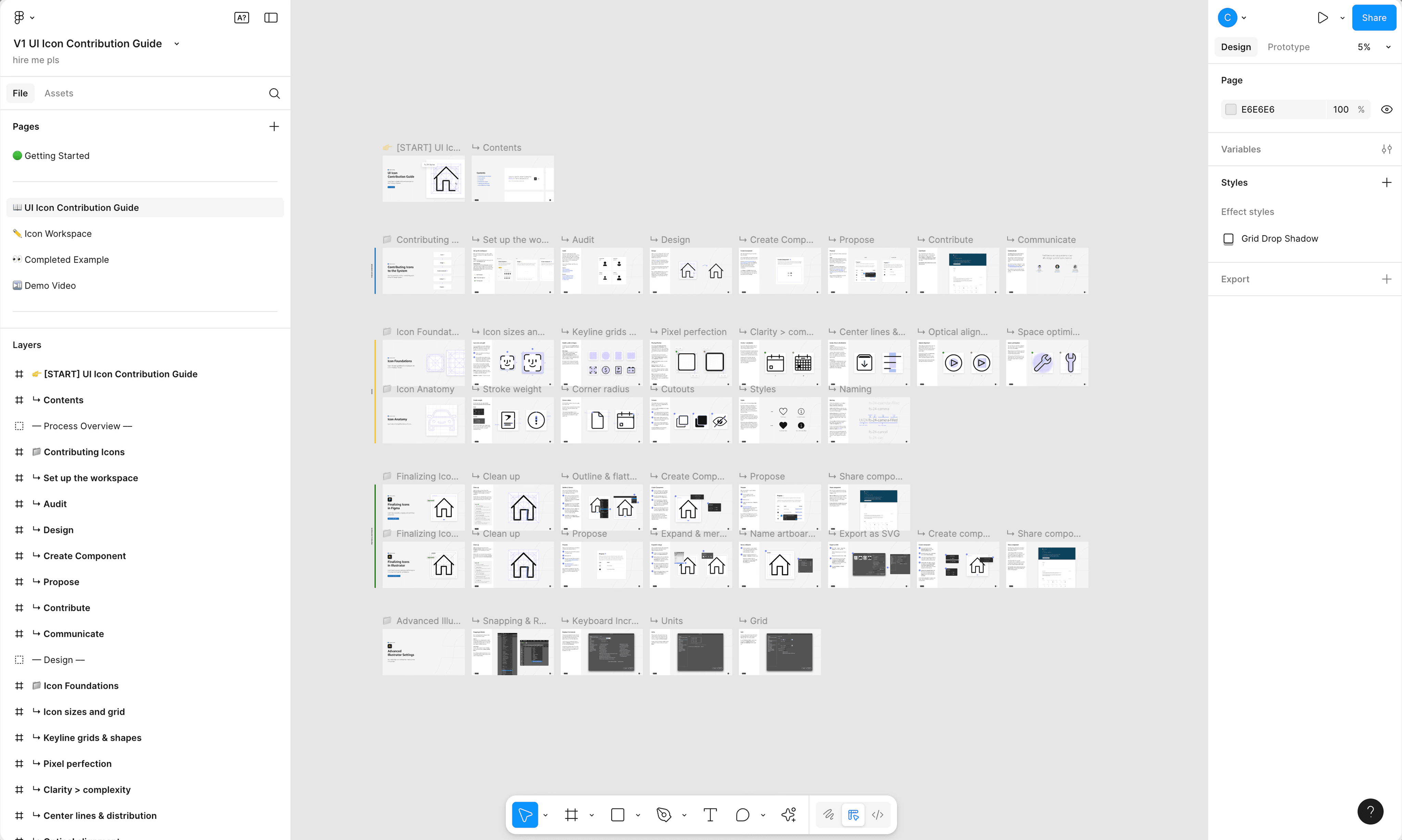
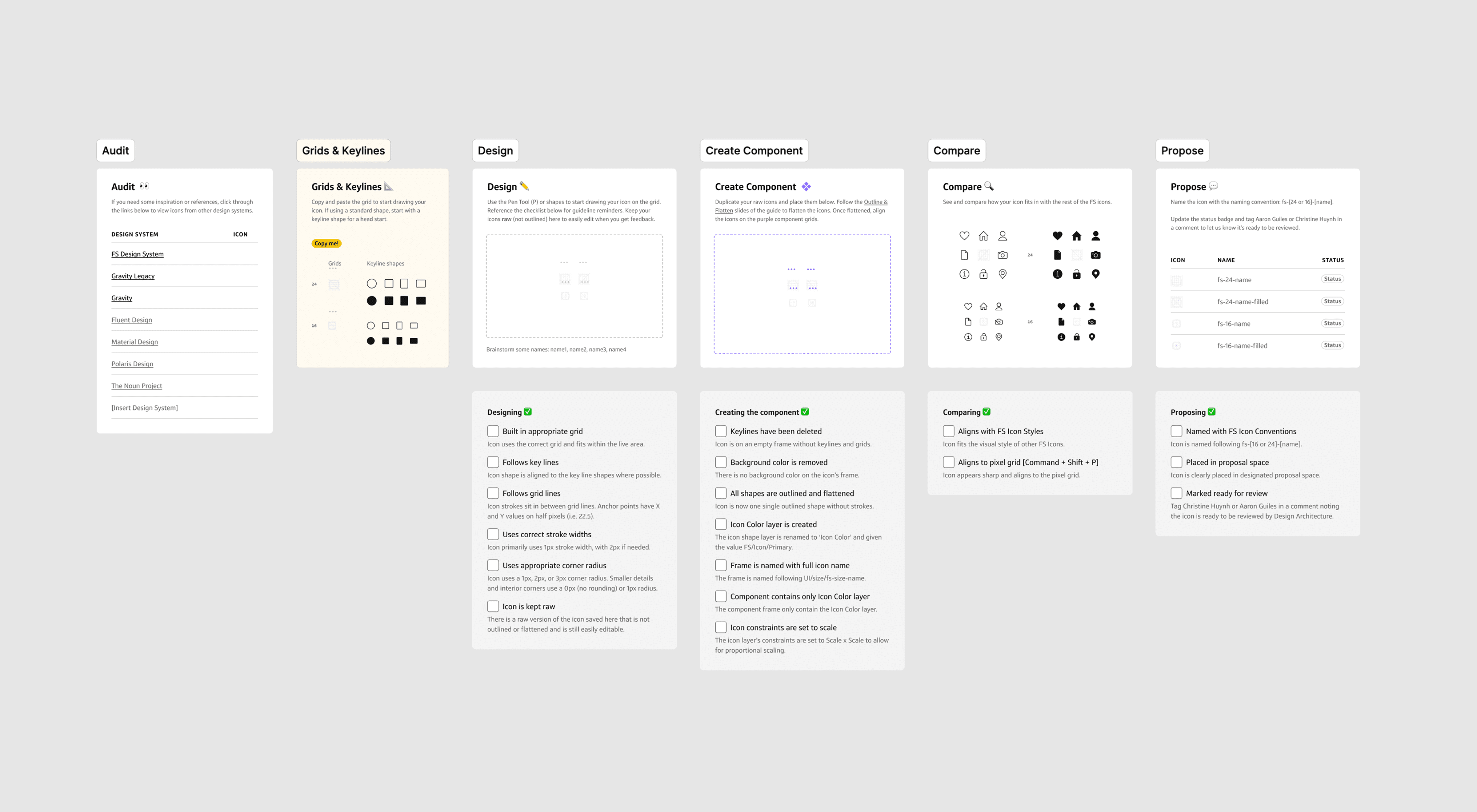
After reading through the guide, designers can practice and play in the workspace. The space is set up step-by-step with instructions and checklists for creating an icon from beginning to end.
Key features
Individual spaces for each step of the icon creation process
Built in references and links to icons from other major design systems, most common keyline shapes, and our universal icon grid
Checklists including guidance from the guide itself, including correct stroke widths, corner radius, flattening instructions, and naming conventions
Auto-fill of the final compare and propose steps using the new icon component
A comparison grid including existing icons to ensure fit, cohesiveness, and optical alignment
Status tracker for the designer and design system team to communicate icon status
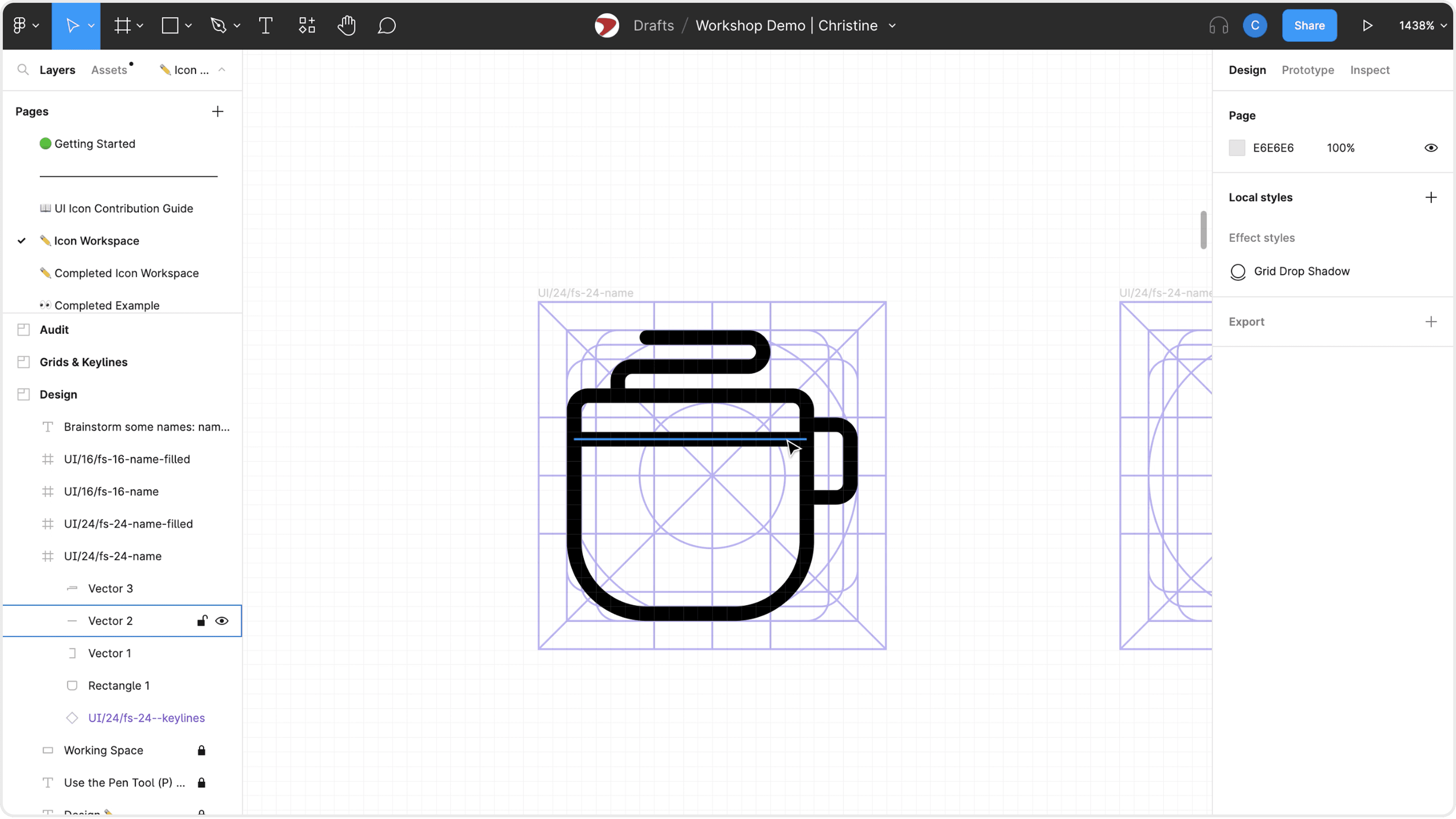
03 The demo
In addition to the static file, I recorded a demo of making a simple coffee cup icon, embedded into the file and accompanied with a completed example page. I also taught an icon creation workshop for all of our designers to make an icon with me step-by-step.
Key features
Recorded as a re-watchable demo and presented as a live workshop
Completed example page included for quick reference
All resources embedded right into the Figma file for easy access
How it impacted our teams
After publishing the UI Icon Contribution Guide and doing a workshop with the design team, the design system received slow and steady contributions of custom icons, ranging from simple filter icons to custom chat bots. Every time someone wanted to contribute a new icon, I did a little happy dance, and the icon was ready to be published in a week max.
Shared knowledge
The process of making icons became shareable, teachable, learnable, findable.
Community ownership
Icons were in the hands of the people, not just the design system team.
Blockers-be-gone
The icons that existed in the system were no longer a limitation, but an opportunity.
More for all,
from all.
Everyone gets icons!
Additionally, we migrated to 2px stroke icons in V2 of the system and in doing so had to redraw a lot of icons, including all of the newly contributed ones. The workspace was the perfect place to do this and allowed multiple people to work on redrawing simultaneously using the same steps and principles we had established already.
The greatest outcome of this project was getting to work with so many different designers on their custom icons. Getting the message, “Morning Christine. I’d like to contribute an icon to the FS design system! Here is the link to the contribution file.” and being able to review, approve, and publish the icons within a week was extremely rewarding and gave me a little opportunity to connect with designers I had never met before.
I received a design award for the impact of this work and it is still one of my favorite projects to date.